Alike
industry
Healthcare
Designing a Community-Driven Healthcare Platform for Belonging and Discovery


challenge
Alike is a healthcare platform that connects users with medically similar individuals—allowing them to share experiences, explore treatments, and feel less alone in their diagnosis. Often described as "Tinder for healthcare," the platform aims to democratize health information through peer-to-peer insight.
Alike needed a new website to support this mission: a clean, welcoming space that could visually reflect their values of community, empathy, and innovation—without sacrificing functionality or scalability. RNR Studio was brought on to lead a complete redesign that honored their brand, improved usability, and brought warmth to a sector often dominated by sterile, impersonal design.
approach
We approached the Alike redesign with equal parts clarity and compassion, focusing on usability, emotional connection, and strategic storytelling.
A New Digital Home
Our design direction centered around one big idea: no one should feel alone after a diagnosis. The new site was crafted to feel open, intuitive, and gently optimistic—showcasing Alike’s unique value proposition while guiding users through content and calls to action with ease.
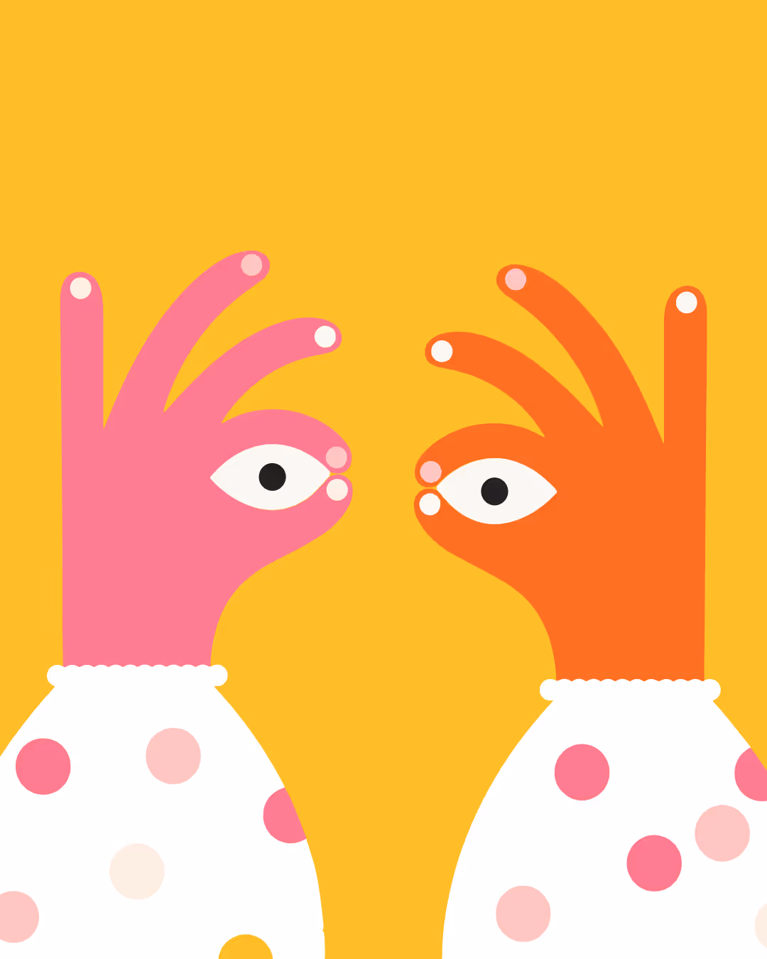
Custom Illustrations, Reimagined
Alike’s original illustration suite—developed by an award-winning artist—was a major visual asset. We gave these illustrations new life through motion, spatial design, and contextual placement across the site. Each element now serves both a visual and narrative purpose: humanizing healthcare and making users feel seen.
Structure That Supports Growth
We restructured the site’s layout to better serve both existing users and prospective ones. The CMS-driven system allows Alike’s team to evolve the content as their platform grows—enabling fast updates without compromising design integrity.


The redesigned Alike site delivers on all fronts: functionality, performance, and emotional resonance.
Elevated Brand Experience
The site now mirrors Alike’s mission to create community and connection in healthcare, giving users a space that feels both informative and human-centered.
Stronger Visual Identity
By refining the brand’s illustration and layout systems, we created a more consistent and scalable design framework, setting the stage for future growth and outreach.
A Platform Built for Empathy
The final product reflects a unique balance of utility and warmth—offering users not just tools, but comfort, empowerment, and belonging.

our work